We first introduced the concept of custom dashboards in 2022 in TradesViz. Since our introduction, users have generated 1000s of unique dashboards with 100s of widgets!
Soon, we added more widget types - the calendar and statistics list exactly one year later. This enabled users to completely replace their original dashboards and set the custom dashboard itself as the main/default dashboard for TradesViz and made checking and analyzing fast, simple, and easy.
With the introduction of AI Q&A, we got a lot of requests for custom statistics generated by the AI Q&A to be added as widgets and we introduced that also - AI widgets and charts - unlocking a new level of customization in online trade journaling. This meant users could create 100% custom, personalized statistics (ones that do not exist at all as a chart on TradesViz) using AI and add that to the custom dashboard.
To date, the combination of AI widgets and a custom dashboard on TradesViz remains one of the most sought-after features among traders who are looking for a journal that can keep up with their needs.
This time, we are focusing more on types of widgets rather than utility. After adding a new widget, you will now see a new dropdown/widget type when you open the widget selection box called "Multi-statistics".
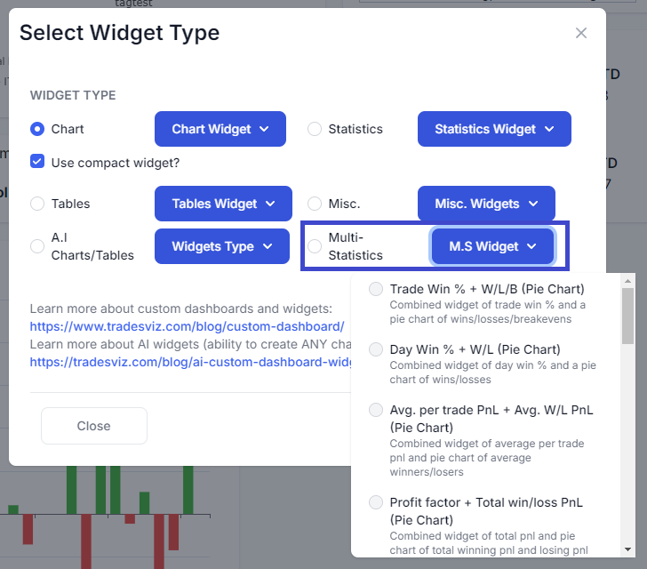
There are 3 types of Multi-statistic widgets and each category has 4 variants increasing the total unique widget count by 12:
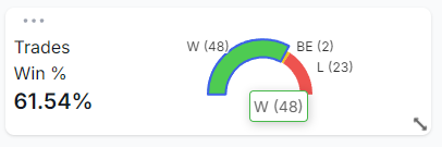
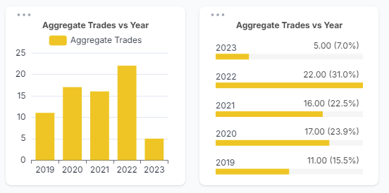
- Chart + Statistics (Pie chart): This widget type shows you stats that can be split into parts - like winrate (wins/losses), long % (long/short), profit factor, etc., and shows you a pie chart along with the stat combined in a compact widget. Here's an example:
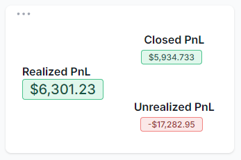
- 3-in-1 statistics: As the name implies, we have combined triplets of *related* statistics into a single widget - like [total pnl, commissions, fees], realized/unrealized/closed pnl, etc., Instead of adding 3 separate widgets, you can add one compact widget that shows you the 3 stats that are important for you. Here's an example (widget in expanded mode):
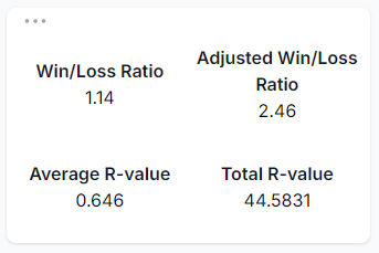
- 4-in-1 statistics: Similar to the previous widget, we have a few variants where it's better to check all 4 stats at once - like stats related to R-value, or performance metrics. Here's an example:
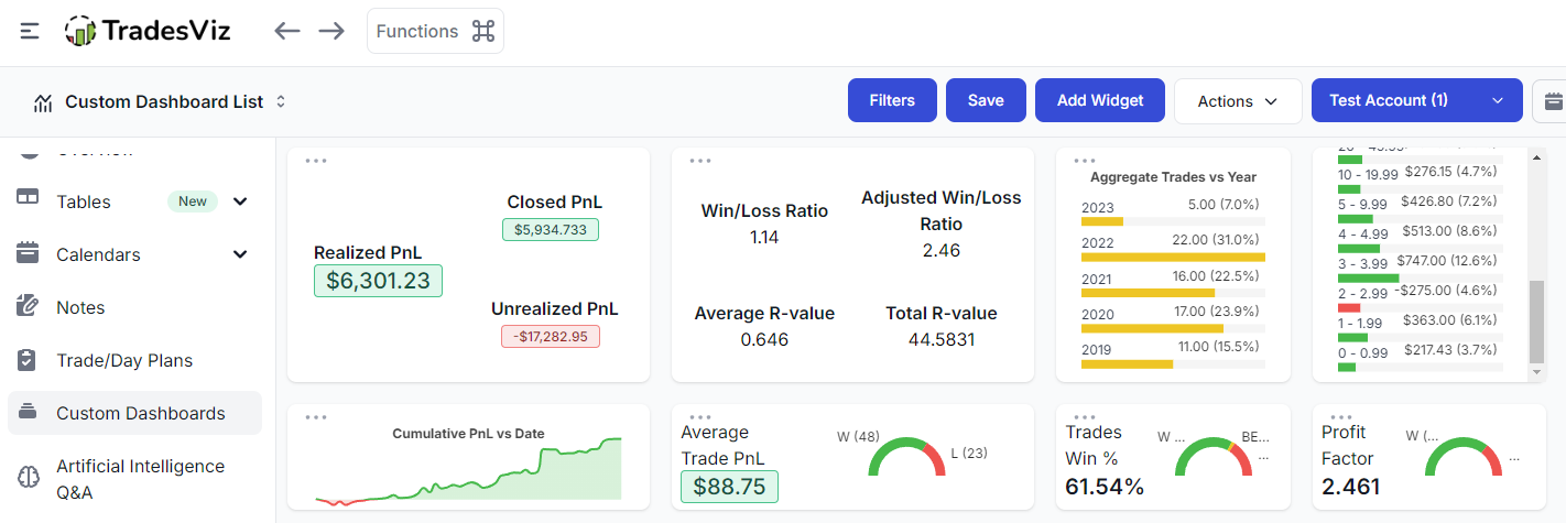
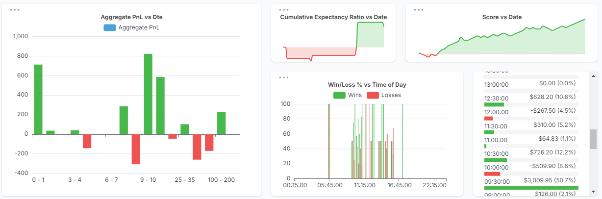
When placed in a dashboard, here's how these widgets look like:
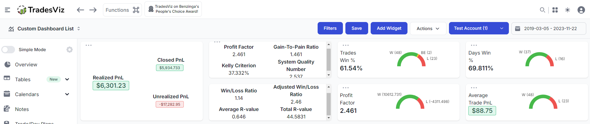
Please note that the widget placement and size of the widget are 100% under your control. Depending on the scaling, screen size, and resolution, you will have different grid-lines which helps the widget snap into place. To drag a widget, make sure to click on any empty area (not inside the chart), and to resize a widget, drag the bottom right corner of the widget.
Our goal with these widgets is to provide more interesting dashboard combinations where the data is easy to interpret.
The other update we have for you is the "Use compact widget" mode which you may have noticed in the first screenshot in this blog. Our normal barchart and line charts may not always be perfect for all dashboard types. This is because of the space taken by these widgets and how the data is organized. We wanted to give users more choice and freedom in creating more dashboard combinations by making these widgets compact. Since it'd be quicker to show you the result, here's a side-by-side comparison of a normal year vs trades on the left and the new compact barchart on the right.
A few notable updates are that bar charts with more data, are a lot more compact and there's no need to hover your mouse over the data points to see what data each bar is showing. Also, the height can be adjusted to the lowest level while still making the chart readable. Due to the layout of the chart, we are able to show the label, data value, and also the % contribution among the entire dataset in this chart.
This mode applies to all bar charts where there is a single data source (for example, win-rate charts with multi-bars cannot be simplified or made smaller - they will retain the same shape/size/attributes) and all line charts. Here's a compact line chart example:
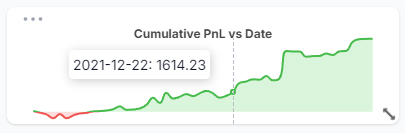
This cumulative pnl line chart which could typically take up ~10-25% of your dashboard is now available to be added with the minium height while still showing the data points as you hover on the chart. The difference is that we've removed both x and y axis and made minor changes to the data tooltips to make it compatible with the small size. You can, for example, have multiple similar charts in a single row of your TradesViz custom dashboard which can at a glance tell you the info you need immediately. Finally, here's how these widgets look when placed in a dashboard:
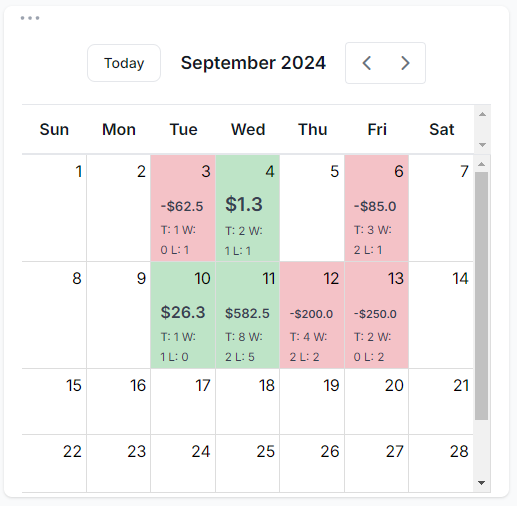
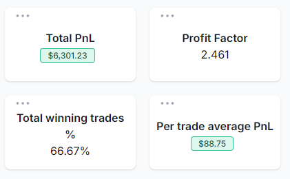
Other notable improvements include proper scaling of calendar widgets and text alignment for single stat widgets. These improvements can be seen below.
 |
 |
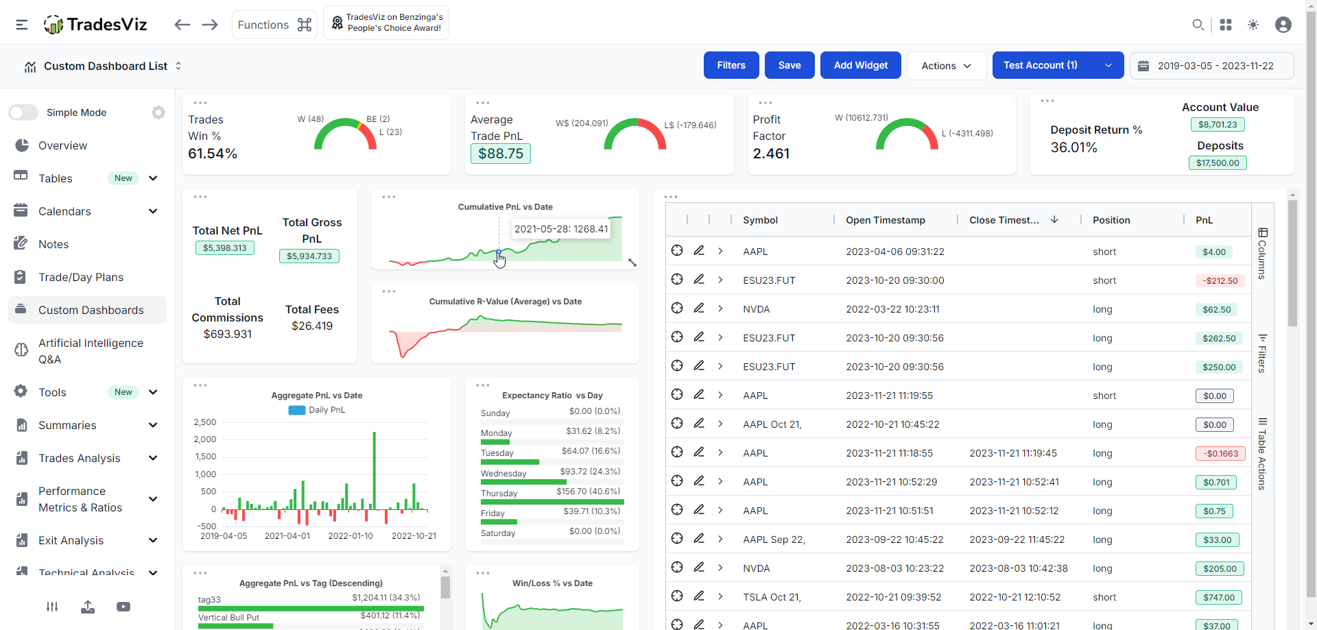
We hope this opens up new possibilities on dashboard creation - specifically, a dashboard that you would like even more than the ones we have right now. Here's a full TradesViz custom dashboard view with some new and old widgets:
As always, our focus is on utility first. These new widgets, while they are limited now (~12 variants), still can make your existing dashboard better with small arrangements. These improvements are also based on cumulative feedback we've received from traders so we are fully open to adding more widgets, and widget types based on your feedback. We are actively looking to add more of the 3 new widget variants we discussed above so please do share your ideas and feedback to [email protected]!