Flexibility has been one of the strong suits of TradesViz since day one. From the settings used to import your files, how your data is processed, account settings, and more - almost everything is customizable.
We first introduced the concept of custom dashboards on TradesViz in 2021. It was only ~6 months or so after the release that the usage of custom dashboards exploded on TradesViz. One of the reasons for this is flexibility and change isn't always easy to get used to when you've been stuck with using a static platform for years. We intend to change that over time and in 2023, the state has changed so much that from a user's perspective, a journal without custom dashboards or customizable stats is not even worth looking at.
That's why we introduced the world's first and (still) the only journaling AI Q&A system in TradesViz and the ability to add any result from that to the custom dashboards on TradesViz as custom widgets.
Prior to the release of the custom widgets feature, there were ~600 pre-build charts/stats from different parts of your dashboard that you can add as widgets to the custom dashboard. But now, with the AI query, the potential no. of widgets you can add is INFINITE.
The no. is not the highlight here - rather, the applicability and the space that the feature now covers. You may be a trader looking only at specific instruments training specific strategies. You can create precise AI queries and add the results to your custom dashboard (which is always auto-updated whenever you change any global filters) or you can be a simple beginner trader who wishes just to monitor pnl and win rate - in this case, you can add few custom widgets and set it as your home page.
That's why we call TradesViz the most customizable online trading journal bar none. So far, TradesViz users have written and used over 10,000 unique AI queries. That's 10,000 unique stats/metrics specific to the trader/user who created each query.
We want to start bringing the same level of flexibility to the most visited pages on TradesViz: The trade and day explore pages.
Starting today, you will see a new button named "Customize" at the top of both of these tabs.
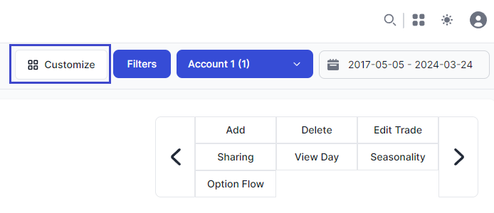
Clicking on this will open up a popup that allows you to customize what you want to see and if you want to customize the arrangement the explore page. We will split this into two features and first explore the options that allow you to customize what you want to see.
Customize what you want to see
Here's what the customize panel of the trade explore page looks like:
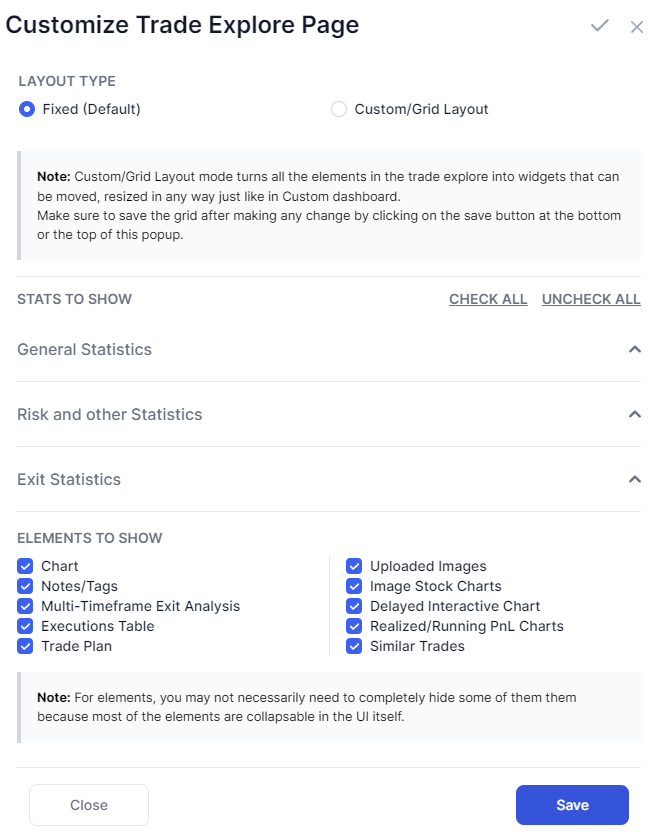
At the top, you have the ability to switch between a grid-based layout which allows you to move, resize, and rearrange all the elements of the explore page as you wish - we will explore this in detail in the next section.
All the checkboxes you see are related to the stats and elements you see on the explore tab and this part changes whether you are on the day or trade explore tab.
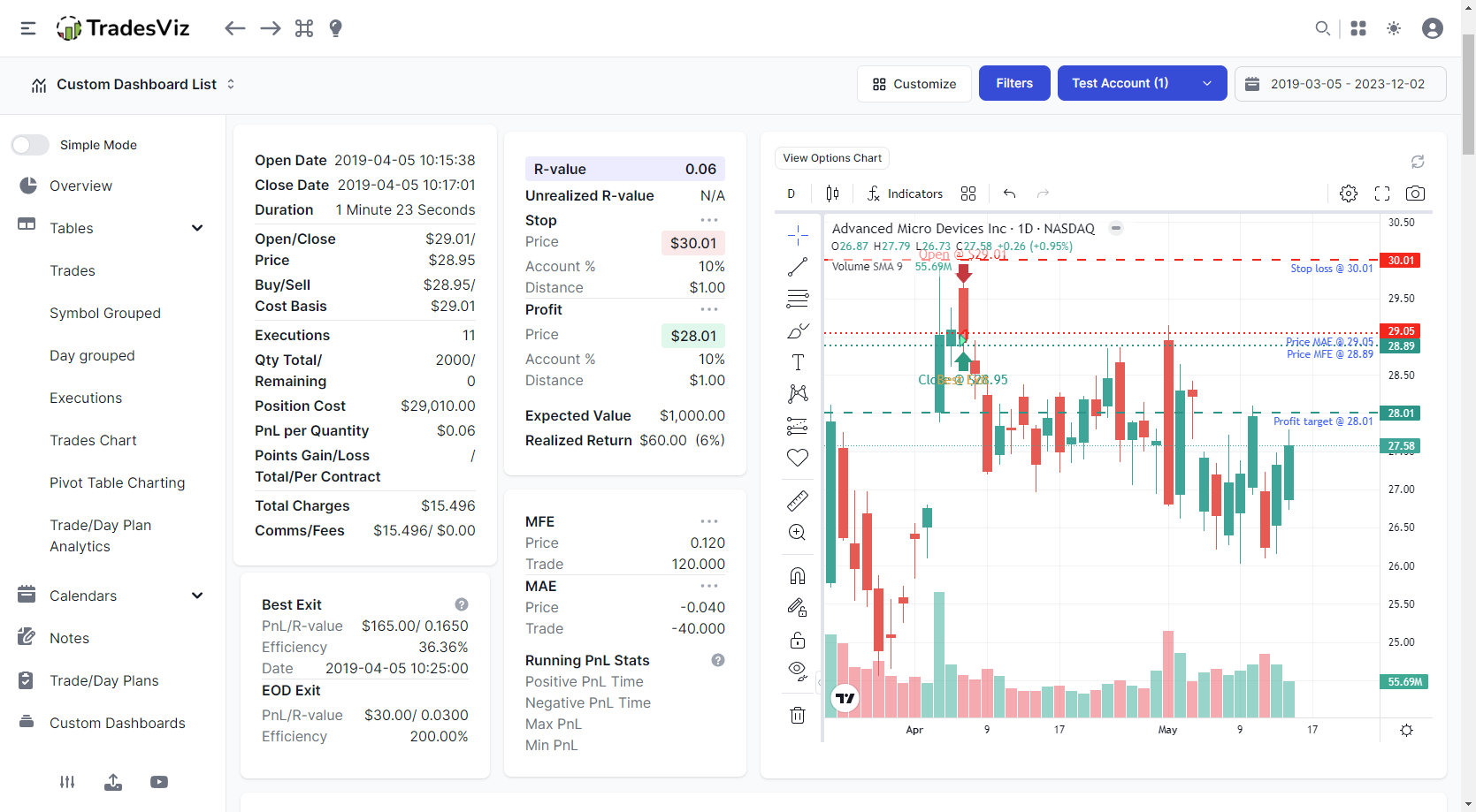
The stats to show section correlates to the stats you see on the top half of the trade/day explore page. Here's a screenshot to remind you of what it looks like:
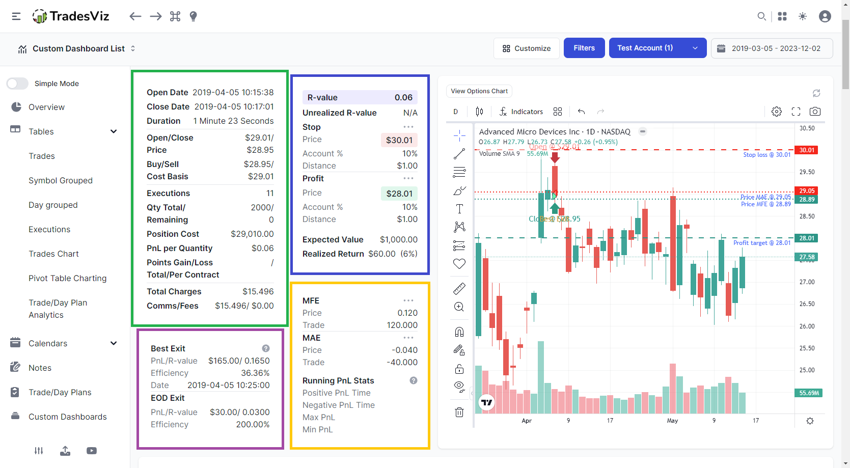
Note that we have highlighted each section in different colors to help with the context of explaining how they are grouped under the stats to show the section.
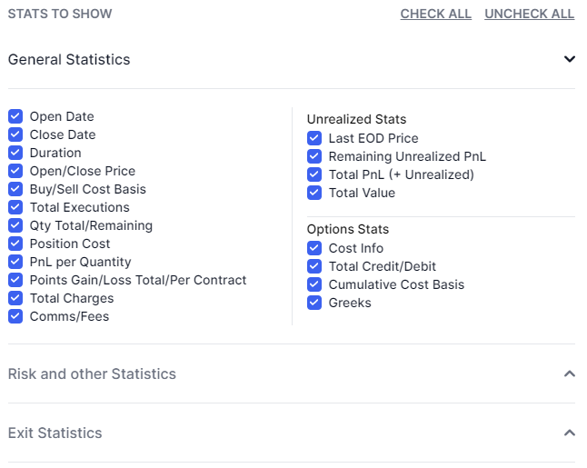
- General statistics contains all the basic stats (green box) along with unrealized stats and options stats (both of which are not shown in the screenshot above as the trade is closed).
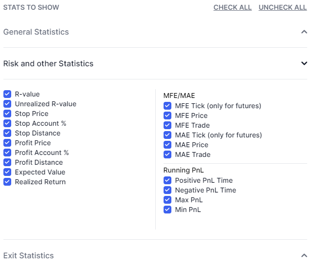
- Risk and other statistics cover 2 sections: MFE/MAE stats + running pnl (yellow box) stats and the R-value related stats (blue box).
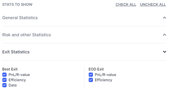
- Finally, the exit statistics section contains EOD/Best exit stats.
After the stats section, we have the elements to show section which gives you the ability to completely hide certain sections like the uploaded images, notes trade plans, etc., This can be useful if you don't particularly use a specific section. For example, not all traders upload images so if you prefer that section not to be shown to save space/reduce scrolling, you can disable it from this section.
The purpose of this is quite simple:
Based on what you've seen above, you can pretty much disable every single element if you want to. Meaning, you have 100% freedom on exactly what you want to see in the day/trade explore pages.
Everything we've explained above also applies to the customize menu of the day explore tab.
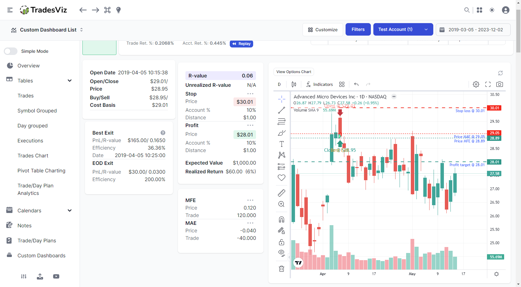
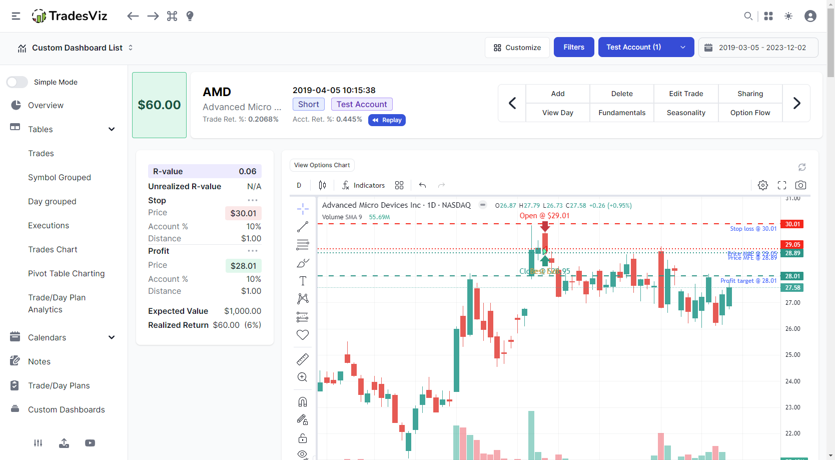
Before moving on to how the grid mode works, we will see some examples of how the trade explore page looks with different configurations of the customization options.
 |
 |
 |
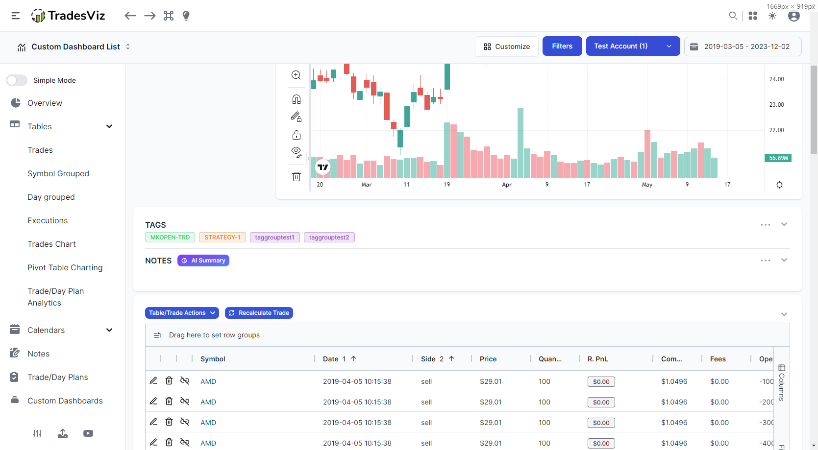 |
Each of the 4 examples shows how unchecking various stats or entire stats of a particular section works. For example, at the bottom left corner, you will notice that the entire overall statistics and other sections are completely gone - this is the way the hiding logic works. If all the checkboxes under a specific section are unchecked, that box/container will also be hidden. Finally, in the bottom right corner, we see the effects of hiding multi-timeframe anlaysis along with the trade plans section.
What you've seen so far is 50% of this feature. The interesting part comes next.
Now that you can hide the stats and elements to view only what you want, using the layout/grid layout mode will allow you to move ANY section of the explore page just like you would in the custom dashboard of TradesViz.
Customize arrangement/sizes of elements
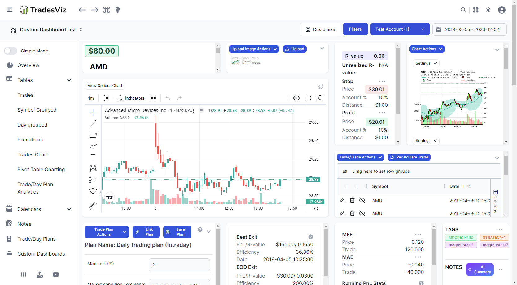
We'll start off with an example. Since TradesViz's explore tabs have mostly remained the same since our inception, seeing the images below might surprise you if you are an existing user.
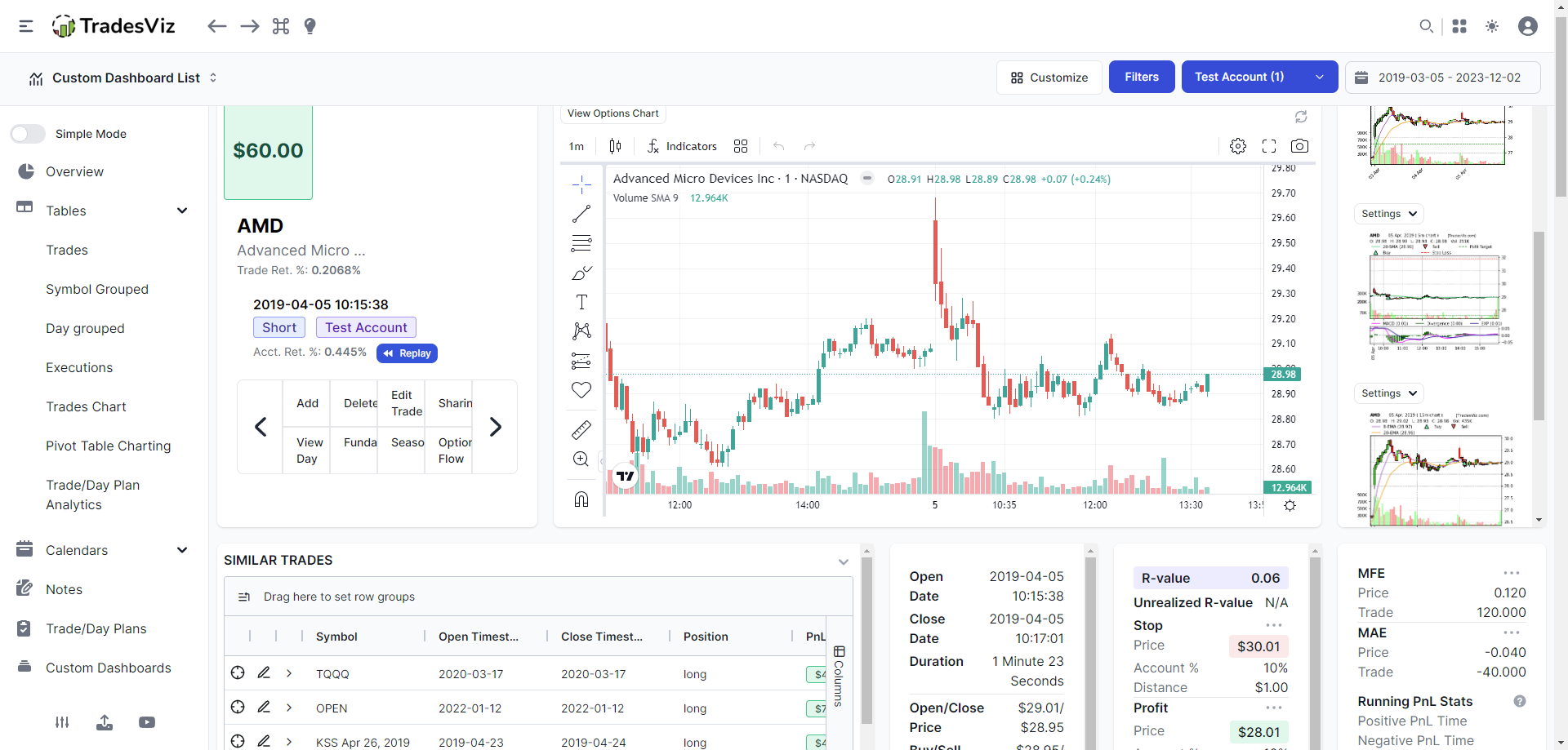
Surprised?
Reminds you of the custom dashboards? Because that exact functionality is now available in the day/trade explore tabs - infinite possibilities on how you can rearrange and organize your data.
In the customize popup, once you click on the "Custom grid/layout" option and click save, you will be able to rearrange, resize, and move any of the UI elements. Note that this is AFTER hiding the elements that you've unchecked. For example, if you've unchecked the executions table, that will not be available in the custom grid.
Once saved, this layout will load automatically whenever you launch TradesViz.
Note: When moving the widgets over chart elements, don't move directly over it, but via the side. An example video is shown below on the construction of the custom grid.
Here's another example of a custom trade explore grid:

As with the previous section, all the examples, and instructions mentioned here also apply to the day explore's grid customization.
We hope this makes looking at your TradesViz journal truly personalized and specific to YOU as a unique trader.
Let us know your feedback, questions, and feature requests by emailing us at [email protected]!
